Sunday, May 10, 2015

Eleven Favorites of 2014

Of course it's kind of too late for this, but as I'm unpacking my comics from crates after renovations here and happily remember reading them, I do feel like a Best of 2014. Please excuse the snapshots, the scanner is still wrapped up somewhere. Here goes:

Eleven.
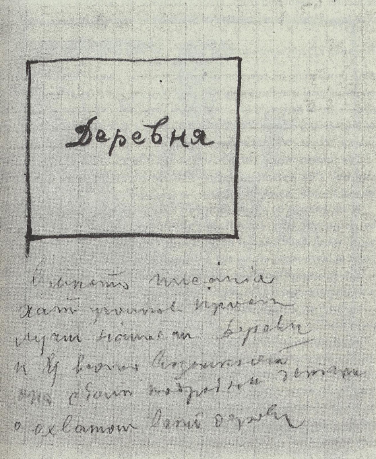
World's Finest Comics 196 by Bob Haney, Curt Swan, and George Roussos (DC). Featuring the Kryptonite Express! Well, dunno, somehow I couldn't find me a proper superhero series to love this year. Some very ok ones, but nothing really exciting. So I started buying old stuff to keep me happy, and one that I discovered was this issue, which is the only superhero comic I ever read as a child! I was kept on a strict diet of Asterix and Lucky Luke when I borrowed this issue from a culturally less protected playground acquaintance and it fried itself into my budding superbrain forever. Here's a scene I especially remembered, a description of which allowed me to find the issue through the web:


Now what's so amazing about this comic is that despite the haphazard mixture of elements (e.g. a top-hatted antique train collector cum mad genius crook more or less out of Jules Verne sleep-gassing train passengers with the help of trained flocks of bats), every element of the plot has the uncanny inevitability of the only story ever told.

Ten.
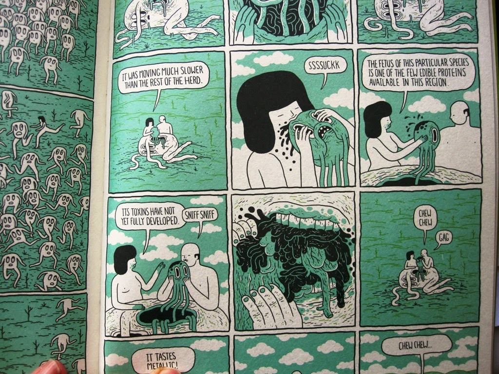
Safari Honeymoon by Jesse Jacobs (Koyama).


A newly married couple hunt gross insects and other creatures which in turn fight back by occupying them as host bodies. The book also works as the portrayal of a sick Garden of Eden with the guide as snake, or maybe everybody as snakes, and the author very much as God, unveiling to us the abstract geometry of all matter that makes up the fabric of life. Jacobs has also published a mini in 2014 titled Mathematical Solutions for a Global Crisis, which is in even mightier God mode. I'm not sure how much further in that direction I'd want to follow him, but for now he has some excellent survival tips.


Nine.
Juvenitive 3 by Jason Murphy (Subferior). This is about poses that can be struck with the help of a sort of rubberband figure, or sometimes a subcontrabass sax tubing figure, or a limp cushion figure with a bulb on top; poses that seem to reference classic cartoon slapstick situations without really playing them out. I've seen minis by Murphy where that didn't quite gel for me, but this issue has an extra looseness that makes it perfect. It also helps that some of the tableaux ...


seem to remind me of mid-60s Valerio Adami ...


(which is very much a good thing)


... and so on eight we have:
Pictures with connexions by Valerio Adami (Galleria Schwarz, Studio Marconi). "This catalog attempts to record a creative mechanism," the zine-like catalog itself informs us. It features a selection of 1966 paintings after found photos from magazines etc. An example will best show you the mechanism at play. On the cover, there's Matisse doing his best Freud impersonation:


On the first page there's Adami's mechanical translation of that:


Which shows, as the artist explains: "Me substituted for Matisse--while I am working in a pair of sky-blue [this we have to take on trust, most of the catalog is in b/w] Stirling Moss type overalls, associating the penis-pencil with Matisse's phrase, 'I have colors and brushes, and I must express myself with purity.'"

Seven.
Pyramid Scheme by Josh Burggraf and Victor Kerlow (Yeah Dude). One late night last year I watched an hour of Tex Avery cartoons to recapture the sense of anarchy they had offered me as a child (classic cartoons on tv was something I was allowed). They were still great but now they appeared almost mechanical in their excessive build-up toward one expectation after another to be stunted with a no-surprise surprise. The awesomeness now seemed to lie in the humorless precision of those variations on a long drawn-out punchline. (Very Germanic, no?)


That has nothing at all to do with the effortless absurdity of Pyramid Scheme, which feeds from completely different sources, except it fulfills my desire for no method at all. There's a bit of good-natured splatter that is maybe borderline anarchic, but it hides its mean temper behind tender lilac tones. Then there's real jokes or at least real silliness of the don't-touch-that kind with immediate payoffs. There are tons of references from, I guess, Donald Duck spacetrip adventures, to tripping in general, to Keith Richards snorting his father's ashes, and many more, none of which I get.


We must read panel for panel, because each panel drops the accents on a different beat, and on each page the characters completely change complexion anyway, as Burggraf has some serious chops and tugs stuff toward surreal battle scenes, while Kerlow favors a natural goofiness so during his pages objectives tend to be forgotten. Fun! (Isn't it sad, though, the small child protected only by his socialist gnome hat, alone in big space?)

Six.
Theth by Josh Bayer (Retrofit). I am sure this is the most proper comic I've read from Bayer so far, no scratching out or tipp-exing things, no sudden switches of pens, no careless stapling through the edges of pages ... but then this is serious, a classic coming of age story, or maybe a classic coming to terms with your comics addiction story.


The boy Theth (Seth with a lisp, I gather) also featured in Bayer's retellings of vintage ROM Spaceknight issues, which added depth by subtracting all that was not awesome from the original narratives. Now we get Theth's own viewpoint (somewhat cataracted by the edges of his spacesuit helmet's visor), and while to him comics are a vague proof that something must exist beyond his drab everyday existence (and beyond the limits established by his own personality flaws), comics are not at all a tool for escapism. Comics are a medium that allow you to imagine things and ask philosophical questions when you don't have the words for them. Quite clearly they will lead the discriminate reader, who struggles to analyze his own awestruckness, to a higher understanding of the world (though not to an understanding of comics themselves).

(The only reason this is not my favorite book of the year is that it's so very American and I had to grow up all by myself with just the one World's Finest issue that I had for only a week. You don't know how lucky you are.)

Anyway, you would have to call this a graphic novel. You can read the hell out of this book.


Five.
The Incredible Hulk 268 by Bill Mantlo and Sal Buscema (Marvel). I actually got this because Theth reads it in Bayer's first ROM from 2011. There Theth's mother picks up the issue and laments: "Everything you read is angry and weird. Life isn't some twilight zone where everything ends up with a scary twist." Theth in return thinks: "It's that stupid Hulk comic [in] which nothing even happens--it's supposed to be all eerie and dreamlike but it just doesn't feel as strong as they maybe wanted it to ... It's not fair that I should have to defend it, I'm not done judging it." ... But no, it is as strong as maybe they wanted it!


There's a benefit to reading this stuff from such a distance (locally and in time). Especially Marvel comics (much more than DC) from the 80s are so faded already (well, what I get from ebay) that they appear positively antique, or maybe timeless (which works because I as a German, while 14 in 1982 and so within the right age group, have never seen most products from the ads before). So the act of reading feels like excavating relics of a remote culture. It has become eerie, this mad, urgent energy, over the top emotionalism, the scream Buscema grafts onto many of the faces, at once unspeakably angry and limp with despair, pure creatureliness, and at the same time of course a mere ornament of the face, an author's trademark. And yet the comic for me exists beyond authorial intent, because I have no idea how to take it. Were they serious? If they were, the story ends on the most soul-crushing of notes, Hulk making short shrift of the Pariah: "Hulk will crush stone! Then let spirits find somewhere else to live!" (They do survive between the lines, happily.)

Four.
Eel Mansions by Derek van Gieson (Uncivilized Books). I would recognize few rules on which comics I like and which I don't, but one hard and fast rule would be that I hate comics in which faces illustrate or amplify what's being said in the speech bubble. Luckily, in Eel Mansions most of the characters are shooting sideway glances to check if the character on the other side of the page appreciates how they themselves will fully treasure their own wit. And they come up with wisecracks objectively out of step with proceedings around them, yet are safely contained inside their own circle of references. I guess it's the resigned self-delight of the characters which holds the whole thing firmly together despite all the willful switches (and appropriations, there's even a Moomin riff-off called Doomin) of styles.


I read the six minis (the last two in 2014); right now the book is out as a trade at twice the page size (the cramped lettering can be quite hard to decipher in spots, so more size will help, grrr ... but then again the squint you need for this equals the squint you need for a fading, dissolving old Marvel page, except you get tons more ink). I did not follow the plot, if plot there was, so I can't tell you what happens. Even when I try to pay close attention, ten pages later I can't remember anything as this seems constructed in a classic Russian novel kind of multiplying cast of character treatment. (This should have its own wiki page, also for spotting the references and links to the songs etc.) But then I'm not into plotlines anyway, so I read it for the vibrant tone, that of the blackest ever ink and of the conversation and the sly expressions on faces that always impress the observing reader by force of pose and personality.


Three.
The Invincible Iron Man 169 by Denny O'Neil, Luke McDonnell, and Steve Mitchell (Marvel).


Is it relevant that three years later Jeff Koons brought those same booze signs into the gallery space?


That was for his series Luxury and Degradation, and most comments on this Iron Man phase, during which Tony Stark boozes out completely (I'd count roughly 166 to 170 as the absolute classics before a SHIELD story, which includes strange aquamarine creatures, cuts in and starts undermining things), seem to remark on how the portrayal of alcoholism and abjection here is too simple or too corny or whatever, but I find Iron Man's drinking absolutely befitting a superhero and his mad actions highly deserving of a reward. The art is sometimes a bit wooden but always on the nose. The stakes are high, the battles senseless. 


Two.
My School Sunk into the Ground, So I Had to Dig to Get to My School Reunion and How to Make a Puppet by Malcy Duff (self-released). It's Year Two of my ongoing Malcy Duff addiction. So how do I rate him now I've got all the older minis I could possibly get and am reduced to following the current output? I still compulsively grab them from the shelves whenever I find myself with a free minute. Still let's say I'll place him on two, because I can't have the same number one every year. Also of course I can take it or leave it.

I'm not sure I can pinpoint how the new output varies from the previous. Maybe the rhythm is less quantized? You have heavily superimposed drawings followed by especially blockheaded blank pages ...

My School Sunk into the Ground also has electric dowsing (do you call it that?):


How to Make a Puppet comes in one of my favorite Duff covers (a sock performing a headstand on top of a chest of drawers, google it) and is sort of a reverie on the noble sport of table tennis (I seem to remember that an earlier mini by the author was mostly about tennis, so it might be enlightening to compare the two, but I have yet to unpack the crate that one's in).


It appears table tennis is a very lonely sport whose limited formal repertory can be reduced to the letter H. That formal repertory, though, can be found even beneath the self-estranged nature that we call a park, which we cross when on weekends we go and watch the library from afar. Loads to chew on! Incomparable linework, idiosyncratic timing.

I still cannot make a puppet.

One.
Isaac by Nathaniel Walpole (self-released). This is probably another coming-of-age story, like Theth, and also one about finding one's place within natural surroundings in a mutual truce, which relates it to Jacobs' Safari Honeymoon. Isaac is some sort of man creature with a phallic neckhead and a phallic tail and a not quite as but still phallic phallus, who has to learn to govern his typically male urges and not to fuck with nature and its creatures (including man) quite as willfully.


The drawings look much more awkward on the page than they do in these snapshots (it's not a mini but a school pad-like A4). They seem executed in no longer quite fresh fine-liner on sandwich paper, and the more naturalistic elements, like the members of a bronze age family Isaac does battle with, are rendered with schoolboy studiousness rather than freely inspired lines. (Or like an autobio comic. The denser textures are nice and deep, though.) This awkwardness seems very necessary somehow, in that the page is not mastered just like the narrative remains open. The whole thing has just the right degree of openness for me, a very selective viewpoint which never seems to transcend the given situation (or maybe Isaac is just a slow learner?) ... much richer than God perspective in the end.


Usually I'm all for mad skills, though, so I am very excited by the promise of some more recent drawings Walpole has posted on his tumblr, which show him experimenting with different speeds of line etc. Now a comic of these ...

P.S. On a historical note, Wassily Kandinsky was the first to try and develop an Isaac out of a horse during an improvisation in 1911:


He failed and chose abstraction instead. Probably he would have been more successful starting from a human figure, but these were never his forte. Still, see how close he got:


Friday, April 11, 2014

Village in a Panel


This is a village in a panel by Kasimir Malevich. There's a small post about that and Malcy Duff's comics (see previous entry) over at my pod.

Sunday, January 19, 2014

Five Favorites of 2013

This is more fun if you have a hunch of my questionable tastes, so first let me think what my top five of 2012 would have been. Best for me was definitely Blacklung by Chris Wright. I should write a post about that sometime. Second place I'd give to Hellblazer, trusty old bastard, third maybe the Lilli Carré collection, fourth would go to the first Animal Man trade (oh did I have hopes in that), and then either Jesse Jacobs or the first trade of Waid's Daredevil (which also immediately afterward dropped in quality). I'm sure I'm forgetting something but this sounds about right, Fantagraphics-type books and superheroes who were in much better shape then. My list for 2013 doesn't have much left of those, but feels similarly unrounded. This is not on any perceived order of objective merit, but simply what I loved best:

Five.
Theremin 1 by Curt Pires and Dalton Rose (Monkeybrain). I was actually reading a proper Theremin biography, subtitled Ether Music and Espionage, and while the subject was completely fascinating...science prodigy, instrument inventor, spy, working in post-revolution Russia under the urgent expectation to come up with something good for state prestige, living in the US as sort of a socialite (is there a pun in that?), still the book was tough going and I didn't get very far. Probably because it stuck with the sources and had most to tell where details were richly documented, and not where we'd want to imagine stuff. And that is where Theremin the comic came in and delivered all the fantasy hoped for, keeping it much more true to the character potential. Because when you hit the right frequency on the Theremin:


It's actually The Red. Ouch. I have no idea what it's doing here, I thought it was busy turning the DC universe into a shapeless mire. Still you can maybe see here what I like about the art: sparse lines with a somehow oldschool stiffness that leave lots of space to be creatively filled with anything from flat computer patterns to ornamental brushstrokes of analog paint... But what mainly made the issue so brilliant for me was what usually would annoy me, that it was pure exposition, tackled not in a careful manner, but instead everything thrown at the reader at once (as befits a character successfully performing a double assassination of Lenin on two different timelines). Of course, this opening move could not be followed in the same vein. The second issue started "one year later," and then the storyline kicked in and came with lots of wondrous incidents that made the book not so amazing anymore.

Four.
Hellblazer: Death and Cigarettes by Peter Milligan and Giuseppe Camuncoli or Simon Bisley (Vertigo). The news of course being that here was the end of the line...


I'm rating this higher than most people do, I think? Milligan's run is my second favorite of the longer Hellblazer runs after the first two Delano trades or so, and it's my favorite Milligan run on anything (his surrealism in e.g. Shade or Animal Man is a bit too forced for my tastes, there's nothing more easy than organizing meetings between sewing machines and umbrellas, so it's shorter stuff like Face or Flowers to Rhino that I really love). Also, the series had Camuncoli at his best (and it looks like he'll be completely eaten up by the really big mainstream projects now, getting inkers to soften the biting of lips and crumbling of eye sockets, so who knows if he'll ever do anything worthwhile again). Anyway, the book goes out in style, offering plenty of looking back without getting too sentimental, and does a good job killing off Constantine in senseless fashion, except he saw a chance to go which might look better on the tab sheet in hell than what he rightfully would have coming. I thought Milligan was about done with the character anyway, so it was a good moment to go for him too. By the later parts of this collection the plot felt noticeably reined in, and the pacing became heavier on actual development, but the incidents continued to entertain (Constantine smoking his own dead ashes to top Keith Richards) and the ending's not the feared cop-out. Constantine is dead alright and properly shellshocked by the fact he no longer has a scheme in the game (see above). (That guy Constantine still running around the DC universe is of course an impostor who must be ignored.)

Three.
Copra 6 by Michel Fiffe (self-released). Now I know from the many favorable reviews that the series is altogether a feat as a whole, and I'm sorry for being so perverse, still I vote for only this single issue as a standalone without knowing or wanting to know much of the rest. The issue comes at the end of the first story arc, and team Copra and a few presumably more evil characters are battling it out after all plot duties have been performed. Since everybody also gets a little descriptive box at first entrance, stating their name and prime motivation ("Gracie: likes to punch and kick"), there's no context really lacking and nothing to prevent us from the pure appreciation of inventive draughtsmanship which the carnage provokes here...


It comes down to a battle between one Man-Head ("street fighter, widower") and Vitas ("main bad guy drunk on power"), with other staff jumping out from the works and landing a blow or two only to abstract themselves and vanish again. I suspect a strong meta layer both in homage to classic comic book fights and there is reflection of broader conventions of depicting violence e.g. in a very impressive two-page sequence where Man-Head recites his life story while battering away on an already beaten opponent, the life flashing through the mind of the aggressor instead of the one who's about to die. By the way, the issue is perfectly safe for somebody squeamish like me, especially since without the five previous and six to-come issues I'm not invested in the well-being of any of the characters. It would be no use to read the other issues, I'm never into team books at all. Not into Suicide Squad, which is the main inspiration here. (My rules for the rest of this list are I cannot nominate a single spread only if I haven't read the rest of the book.)

Two.
Miniature Jesus by Ted McKeever (Image). McKeever can be too much for me, an auteur with a vengeance, each page a broadside, and it's probably telling that my favorite of his books so far was Meta4, his most controlled effort, which came in a subdued format and in a rather grayish black and white (I'm not sure if that's on purpose or just a bad printing? anyway it worked great to make it feel more, well, meta). Miniature Jesus is full blast mode again, and even if you read it on the most immediate level as the story of an alcoholic with a little angel (miniature J-boy) and some rather big devils on his shoulders shouting into his ears, the energy level is amazing. But actually despite this thing being built on rather common dichotomies in noir black and white, the story is actually quite slippery, and every cliché might immediately cave in on itself. The tone is informal, there are lots of off-notes even if all that happens might just be spontaneous externalizations of one loser's internal debate. The figures are eternal posers, but their grandstanding might immediately be followed by an apologetic grin. All the conflict seems overcooked, and nobody falls for anybody's worldly wisdom except for selfish reasons...


Possibly the whole drama takes place while the main character walks only a block, and we follow just a single, tired train of thought, him amping up his profane conflicts into a war of the heavens. Not much is resolved by the end, except he won his soliloquy. So that's relatively upbeat. But anyway, even if you choose a straighter reading, it should still work for the art, which is more consistently realist than usual, coming out of a thick chiaroscuro, with sudden clashes of style, as morals can quickly deteriorate the figures into caricaturesque distortion. The images sit blackly on the page with only a narrow frame, sometimes looming there so heavily that there's no room for the page to be composed...each panel is onto itself. It's a complete trip, and the narrowness of theme heightens the punch.

One.
Don't Name Your Hands "Hands" and really a good dozen of other mini-comics from the last decade by Malcy Duff (self-released). So yes I'm cheating here, all of Duff's works were completely new to me and I'm rating their collective impact. Actually his 2013 output is rather on the more reduced side, so it helps to come with lots of expectations on what will happen when you turn the page and have those disappointed. If I had to tell you what the comics are about, I'd say: lovingly rendered awkwardnesses of form. Also: things developing into situations from which there is no escape except changing the topic...


...and they're about an empathy with these things and beings for their awkwardnesses, an empathy not of feeling but of bodily sensation, holding an expectant posture over several panels, feeling my few hairs fluttering in the wind, before we finally make eye contact: what now?


Instead of a storyline, the work  is driven by modes of presentation. Frames present a few choice lines hovering between the edge of a pool in a public swimming bath and the springboard. Some objects present themselves like conjurors performing their little tricks, some forms are exposed by the hand of the author in more autocratic manner... Presentation is about the single moment, so this mode frees up time, and it's amazing how many panels can be fruitfully wasted in the pursuit of the rhythm of not much happening. For example here we have something like a misshapen board creeping out through an opened door until our undevided attention gets too much for it and it slides back again. It's like the abstracted storyboard for a Tex Avery sight gag, say, the endless stretch limo driving through the picture, stretching, stretching, but then just before the big bad wolf at the wheel is waving his sign, "that's long, isn't it?"...proceedings are reversed, and you will never know that there was a wolf, and you can't even be sure it was a stretch limo, and that's it, folks.


Runner-up of the two Duff titles from 2013 is called I Have Never Seen Anyone Hold Their Nose and it has a story written on the cover which begins: "We can see ... A woman putting shards of glass all over the outside of her house." From there we go through eight pages of not very interesting loosely pasted pattern fragments (maybe readable as memories floating like ghosts like double glazed broken glass, if we're searching the story for clues) until we finally arrive at just what the story said we would see, the woman standing before a rectangle inscribed as a house with little jagged fragments that read "glass." So if that doesn't prove the story then I don't know what will. When we turn the zine around there's the exact same story on the cover again, and we go through the exact similar pattern debris, but then we get distracted and end up with somebody maybe holding their nose. But it isn't proven that they do. Then I always flip back a page to stare at the earthworm. I never knew he bore such straight tunnels into the earth, stiffening up half his body with rigorous muscle tension. I must admit that more than once I accidentally chopped worms apart with the blade of a spade digging up earth, and I spent a sorry thought on them wondering if indeed one half would live on like it's said it will. But never have I been so in tune with the plight of the common earthworm.


(Excuse the awful scans. Oh and if you've accidentally found this post because you want to get rid of a Malcy Duff comic I don't have, please make contact.)

Monday, September 30, 2013

Doom Patrol

I've long loved Grant Morrison's Doom Patrol, of course, but never checked out the series that first introduced the team, written by Arnold Drake and drawn by Bruno Premiani, originally as part of the anthology series My Greatest Adventure, then in their own series after just six issues. The Doom Patrol predated the X-Men by a few months, and built off the example of the Lee/Kirby Fantastic Four — with their constant bickering and sense of isolation, they always felt more like Marvel's fallible, very human heroes than DC's self-assured icons. The Doom Patrol are outcasts, their "powers" having resulted from horrible accidents that left them changed and disfigured in various ways, no longer able to fit in with normal society. Rita Farr, once a glamorous actress, is the least changed: she initially isolates herself because she can't control her size-changing powers, and would unpredictably grow or shrink, but even after she gains control of these powers, she identifies herself as apart from society, even though she could easily reintegrate. The other 2 team members, Cliff Steele (whose accident left him so destroyed that only his brain remains, encased in a robot body) and Larry Trainor (irradiated with nuclear radiation, wrapped in bandages and possessed by an energy-based "Negative Man"), are more thoroughly ostracized, considered freaks by the "normal" populace whose lives they routinely save. Drake regularly comes up with outrageous concepts to confront these weird heroes, pitting them against the equally odd Brotherhood of Evil (led by a disembodied brain in a jar) or the shape-changing Animal-Vegetable-Mineral Man.

It's got all the usual problems of comics this old, being mainly targeted at kids, so there's a certain sloppiness and repetitiveness that nobody, I'm sure, expected to matter one bit. As was common at the time, in the early issues the writer and artist weren't even being credited except when someone happened to ask about it on the letters page, a sign of the status of these artifacts and those who made them. The dialogue often just consists of the gang narrating how they're going to foil their latest threat, some of the scenarios cross over from inspired weirdness to just plain dumb, and the fact that Mr. 103 is a barely different retread of A-V-M Man (and that Beast Boy taps into a similar power set as well) is perhaps a sign of the idea well running dry later in the run, at least as pertains to concocting new superpowers. Still, there's a reason these characters and this run have endured. A big part of the appeal is just how strange it all is, and how striking it is to find a goofy kids' comic that deals so candidly with issues of self-image, ostracization, and the frustration of being trapped in a flawed body. Cliff is constantly treating his robot body as disposable, warping and destroying himself, an approach that reaches its peak in an amazingly weird story in #87 where Cliff defeats a villain by using parts of his robot body to get around traps, until he's just an armless, legless torso pinning down the bad guy with metal dead weight.

These characters are very human despite their weirdness, though, and in between the outlandish fight scenes and stiff exposition, they express some very raw, poignant emotions, ranging from Cliff and Larry's sexual frustration (they both yearn for the pretty Rita, though she never seems to even acknowledge them as romantic or sexual possibilities, much preferring the less visibly weird Mento) to the Chief's increasingly desperate attempts to get out of his wheelchair and finally participate in adventures in a physical way rather than just as an advisor. Drake even extends this sympathy to the villainous Madame Rouge, with a long-gestating subplot in which the Chief tries to rehabilitate her, getting in touch with the good side that's been suppressed by the evil Brain's manipulations. This plot reaches its wacky, visually stunning apex in a sequence where Premiani draws Rouge's face being cracked, as though seen in a broken mirror, then stretched apart, until she's literally and physically divided into two twisty, stretchy beings intertwining and fighting — it's an amazing sequence, a perfect example of the visual and conceptual imagination that flows through this series.

It's also a great example of Drake's willingness to let plots gestate over time, as the Chief/Rouge plot develops in scenes scattered here and there across months of comics before it finally takes center stage. He often plotted across issues, writing around the obligatory villain-of-the-month to develop larger plots, like the courtship and eventual marriage between Rita and Mento. There's also the green-skinned, shape-shifting Beast Boy, who's slowly introduced into the title and gradually develops over much of the run's second half, the plot with his evil guardian undergoing many twists and turns across many months worth of stories before he's adopted by Rita and Mento, forming a nuclear family of the weird. Drake's multi-issue storytelling contrasted against a lot of other comics from the time, which tended much more towards done-in-one or two-part tales rather than this kind of extended continuity. The team went out with a bang, too, in a final issue where the Doom Patrol, given the choice between their own lives and the lives of a remote fishing community, chose to sacrifice themselves for the sakes of a few normal people. It's a noble and very unusual ending for a very unusual series and a very unusual cast of characters.

Monday, September 23, 2013

Green Lantern/Green Arrow

This is an important series, a landmark of comics history in which Dennis O'Neil, assisted most notably by penciller Neal Adams, transformed the Green Lantern series into a soapbox for social commentary and polemics, many of them voiced through GL's new costar, Green Arrow, who was recast as a modern-day leftist Robin Hood. It's a pretty astonishing transformation. Before #76, the first issue tagged as Green Lantern/Green Arrow, there was no regular writer on the Green Lantern ongoing, and O'Neil was just one of several writers doing an issue or two at a time, telling generic, disposable, instantly forgettable tales of GL facing off against monsters, aliens, robots, etc. There's nothing in the preceding dozen or so issues, including those written by O'Neil, to prepare one for #76's slap in the face, in which GL and GA face off against a corrupt landlord, and in which GL is famously confronted by a black man who accuses him of doing lots for aliens with purple or blue skin, but nothing for those on his own world with black skin.

Immediately, the duo take off on a trip across America, accompanied by a disguised Guardian from Oa, encountering racism, poverty, drug use, and other social and political issues. By today's standards, O'Neil's writing is preachy, unsubtle, and often rather ludicrous, and he has a tendency for trotting out Nazi comparisons at the slightest provocation. It's politics-for-dummies, in its way as simplistic and morally black-and-white as the GL vs. Sinestro stories that had earlier defined this title. But these are still important comics, elevating these characters beyond the repetitive, thematically threadbare stories that had previously contituted their monthly adventures, suggesting that comics, even superhero comics, could have real moral content and could deal with the real world, however clumsy these efforts often are at tackling these themes.

That sense of a stab at realism is aided in a big way by Neal Adams, whose grainy, gritty art is as much of a game-changer as O'Neil's new stories. With the first O'Neil/Adams issue, this immediately looks and feels like a whole different book, its new street-level themes mirrored in Adams' realistically rendered faces and love of shadowy textures. O'Neil, for his part, doesn't really maintain the same level of commitment throughout this sequence of issues. The initial burst of socially conscious stories lasts a mere four issues before the heroes are once again confronting cosmic menaces and supervillains, albeit with a pronounced allegorical undercurrent to it all. This synthesis is most powerful in a story that casts the villainous Black Hand as an agent of a sinister conspiracy to keep people docile through consumerism; elsewhere, O'Neil offers up muddled and incoherent satires of Nixon/Agnew and women's liberation, with the latter story nearly sabotaging the whole run by making feminists into (literal!!!) harpies.

But then comes probably the most infamous story of this series, the two-part tale in which Green Arrow's "ward" Speedy becomes a drug addict. It's easy to mock now, and there's no question that, like all of O'Neil's work in this period, there's a thread of camp outrageousness here, as well as an over-the-top preachiness that makes the moralizing speeches come across like an after-school special. At the same time, the story is remarkably candid about drug use, and remarkably sympathetic (given the tenor of the times) towards the addicts, who with exceptional self-awareness lay out their reasons for turning to drugs, saying that drugs help them forget the problems of their lives, help them ignore the racism and neglect they face from their elders and the rest of society. It's probably the most morally complex of the GL/GA stories, because though in the end the heroes catch the villain who's peddling the drugs, it feels like a pretty hollow victory, underscored by having the story's last pages take place at a funeral for an overdose victim. This particular villain is caught, but there's a sense that nothing has changed, that the problem is a lot larger and can't be solved with mere fisticuffs or simplistic ideas of "justice" — a pretty mature admission from the superhero comics of the time. Adams also turns in one of his very best sequences in the form of a harrowing page on which Speedy, withdrawing cold turkey, staggers around under the watchful and sympathetic eye of Black Canary, who's helping him through his pain. It's beautifully rendered but horrifying, Adams' expert handling of body language perfectly capturing the young addict's anguish in just a few nearly silent panels.

The O'Neil/Adams run ended with #89, a hamfisted but oddly compelling mash-up of Jesus' death with an environmentalist parable, notable for unsparingly making GL's girlfriend Carol Ferris kind of the villain here, and the story ends with GL blowing up one of her airplanes in a burst of righteous anger. The series blew up too — it won awards but apparently never sold well. O'Neil continued the saga with backup stories in The Flash, with Adams sticking around for the first 3 installments, long enough to give Green Arrow and Black Canary a relatively graceful goodbye before O'Neil started churning out GL solo adventures. O'Neil revived the series years later, but without Adams (Mike Grell drew many of the new issues) and without the social commentary. The issues O'Neil wrote from #90 on, starting in 1976, have very few traces of the earlier series' political ideology or issue-oriented themes. There are scenes here and there that reference poverty or race or drugs, but never in the sustained way that the earlier run had done. Instead, it's a return to space opera, alien invaders, alternate dimensions, and so on, and it's mostly a bore in comparison to the vitality and emotional excess of the original O'Neil/Adams run. There's some camp appeal here — Sinestro disguised as a jester; the bizarre saga of Itty Bitty, a flower-shaped alien who dies and comes back as a zombie flower; Hal Jordan as a trucker who mostly stashes his rig in space while fighting alien menaces; Hal hooking up with and nearly marrying Guy Gardner's psychic gypsy girlfriend. It can be fun, and silly, and Grell (in particular among the several pencillers who rotate through these issues) is a fine artist, but the series is always a pale shadow of its former identity, and it's never quite clear why exactly Green Arrow is tagging along on all these spacefaring adventures at all. His presence was really only required to be a voice of social consciousness and down-to-earth realism, both attributes purposefully missing from the rebooted series.

Monday, September 9, 2013

Vertigo Voices

The four one-shots covered below were released in 1995 on the Vertigo Voices sub-imprint, a series of creator-owned one-offs that, by design or coincidence, were unified by a focus on warped psychology. Unlike some of Vertigo's other attempts at spin-off imprints or events, these one-shots were strikingly successful in creative terms, all four of them great examples of these creators at their best.

Face (Peter Milligan & Duncan Fegredo) - This book's depiction of a slow spiral into horror is really difficult to bear, and that's what makes it so great. Peter Milligan would later examine the questions about identity and appearance raised here in his Human Target comics, but whereas those books had more of a hard-boiled noir/detective genre approach, this is intense, unsettling psychological horror. A plastic surgeon moves out to a remote island with his wife to perform elaborate surgery on a reclusive artist, and, as such stories are apt to play out, the isolation reveals fractures in the surgeon's marriage even as the artist (and his clingy manservant) seem to be teetering on the brink of sanity themselves. Milligan's plotting is dense and unpredictable, and the story takes several unexpected twists and turns before its grisly ending, its instability aided by the fact that David, the surgeon, is a supremely unreliable narrator who keeps casually tossing out lies and half-truths to both his wife and the reader, contradicting himself at every turn. Fegredo's art is scratchy and gritty, with a fine grasp of gesture and body language, and when the story requires rapid descents into gore or surrealist hallucination, he's able to leap into the abyss with the best of them. It's a perfect classical horror tale, in the lineage of Eyes Without a Face and other horror movie meditations on identity, aesthetics, marriage, sexuality, and the nature of monsters.

Tainted (Jamie Delano & Al Davison) - Stunning, creepy, and psychologically engrossing, this is prime Delano, a sympathetic but unflinching case study of three people, each fucked-up and damaged in his or her own way. George, a wealthy orphan, rents out part of his big inherited house to Lisa, a nurse, and Steve, a strung-out addict. Alternating between these three characters, with special emphasis on George, Delano creates a potent and disturbing portrait of dysfunction and disconnection. George is a haunted character, cut off from sexuality, superficially a good man but obviously disturbed in some pretty deep ways — it's apparent from early on what the nature of his shameful secret past might be, but its gradual unfurling is nonetheless horrifyingly mesmerizing, leading inexorably towards the revelation that every reader suspects is there all along. George's entanglement with Lisa, a rape victim who sees her fantasy games with this damaged man as a way of re-empowering herself, only complicates the intense emotions and disquieting forebodings that wind through this tale. For his part, Davison is a perfect collaborator, giving these characters and their surroundings a weighty, fleshy realism that is occasionally disrupted in subtle ways by distortions, skewed angles, shapes warped beyond recognition, before snapping back to the hard surety of reality. He depicts slippages into fantasy or nightmare without the usual signifiers, preferring very subtle distortions until the horrifying visual symbolism of the ending. This is a great short story, drawing on familiar archetypes and ideas but presenting them with sensitivity, psychological insight, and a keen grasp of the unspeakable horrors lurking within the human mind.

Kill Your Boyfriend (Grant Morrison & Philip Bond) - This is probably the most famous of the Vertigo Voices one-shots, mainly by virtue of Morrison's name, though it's definitely nowhere near as great as Face or Tainted. Still, it's a good book in its own right, kind of a more grounded adjunct to Morrison's The Invisibles, which was running simultaneously. It's a portrait of a young girl who's bored and alienated in suburbia, and harbors fantasies of violence and sexuality which she finally indulges by running off with a bad boy who leads her on a crime spree. So it's a pretty familiar tale that Morrison is riffing on here, and he doesn't entirely transcend that familiarity, but he does imbue this book with a great deal of biting wit and a serious consideration of some of his usual themes about society and rebellion. He makes this story all about conforming to roles and expectations; the girl acts out because that seems to be the only outlet available to her, because even her most mild deviations from what's considered the norm are looked on with suspicion. Her father calls her a slut, with mingled disgust and excitement, while rifling through her frilly underwear, and those same underwear later lead the police to some negative conclusions about the girl; any girl who might want to explore her sexuality is automatically viewed with distrust. When society tries to suppress and hide all of this stuff, it expresses itself anyway in warped and disturbing ways, in violence and rage, and that thematic focus ties this book to Morrison's less realistic social commentaries in The Invisibles and The Filth. It's also a darkly charming book, thanks in part to Philip Bond's clean-lined, elegant art, so well-suited to rendering these attractive, sexy young people, as well as Morrison's habit of having the girl address the reader directly, justifying her actions in a running commentary that amounts to a shrugging admission that she had nothing better to do.

The Eaters (Peter Milligan & Dean Ormston) - In contrast to Milligan's other Vertigo Voices issue, The Eaters is less straight-up horror, despite its focus on cannibalism, and more a darkly comic satire that might be seen as the American counterpart to Morrison's maiming of British suburban culture in Kill Your Boyfriend. Milligan follows a family of "eaters" — they hate the derogatory term "cannibals" — as they travel around the country in an RV they won in a contest from an apple-pie company, killing people along the way for dinner. It's a scattershot and unrelenting satire, depicting this family as the quintessential all-American Christians, justifying their murderous appetites with questionable interpretations of vague Bible verses, while criticizing the junk-food culture and societal neglect they see all around them on their cross-country tour. They're Christian hypocrites, feeding the poor with stew made from the corpses of over-stuffed junk-food gorgers, convinced that their own lifestyle is the healthiest and the most morally correct. All the symbols of the American middle class are distorted here: religion, family, mom's cooking and apple pie, corrupt politicians, fast-food burgers and charity for the poor and homeless. The family is pursued by a vengeful apple pie salesman, who bathes every night in a bath tub full of sickly yellowish-green apple pie filling, obviously artificial and practically glowing neon, precisely the kind of mass-produced factory-made junk that this family has cut out of their lifestyle.

Monday, September 2, 2013

I Die At Midnight, The Geek, Prez: Smells Like Teen President

I Die At Midnight (Kyle Baker) - Part of Vertigo's pre-millennial V2K series, this is a fine example of Kyle Baker's briskly paced, animation-inspired humor comics. It's the story of a man who, distraught over a failed romance, swallows a bottle of pills to kill himself on New Year's Eve, only to have his lover return, apologizing and wanting to make up with him. The man then desperately casts about for a way to cure himself before the pills take effect, without letting his lover know that he was so unbalanced. It's frenzied dark comedy, which Baker communicates equally with his expressive, cartoony artwork and the typeset, wryly funny dialogue that he sets beside his images. As in most of Baker's work, he doesn't use word balloons as in traditional comics, preferring to set the dialogue and the occasional narrative captions beside and below the panels — the format resembles animation cells with a script running alongside them, though despite this separation, Baker's words and images definitely work together towards the overall comical effect.

Baker's work from the late '90s on tends to (over)use digital backgrounds, and in this book the Photoshop paste-ups, computerized blurring of figures to connote depth, and sporadic use of digitally constructed objects can be distracting, even if the style is arguably appropriate when Baker uses it for gaudy Times Square backdrops. But the focus, as always in his work, is on his figure drawings, and in that respect he's as great as ever, using exaggerated body language and malleable, mugging facial expressions to give his characters a rubbery energy and sense of motion on the page, a further connection to animation. Baker's humor and energy are more than enough to overshadow the occasional rough digital eyesore, and I Die At Midnight is another fine farce from a master of the form.

The Geek (Rachel Pollack & Mike Allred) - Part of the weird Vertigo Visions series that included Vertigo-ized modern interpretations of obscure old DC characters. This one updates Brother Power the Geek, an ill-fated attempt by Joe Simon to tap into hippie subculture in the '60s, and whose original series lasted just two issues. Brother Power was a living mannequin who, in Pollack's update, is enslaved by a constantly shifting evil being who embodies a carnival barker, a businessman involved in corporate takeovers, a neo-Nazi leader, and other icons of greed and violence. Pollack is presumably staying true to Simon's conception of the character as a wandering signifier for hippie ideals, fighting yuppies and racists and corporate flunkies, but it's all so bluntly polemical and at the same time incoherent in its narrative. Pollack intermingles Brother Power's journey with scenes involving the hero's friend Cindy, who is fleeing a life of prostitution to join a feminist goddess-worship protest group called PMS. Mike Allred would seem to be the perfect artist for this material, with its naive hero and the sweet relationship between Brother Power and Cindy, and his art is the main appeal here, though it's hardly his most compelling work, either. This is a forgettable look at a forgotten character; the early Vertigo era produced so many memorable new slants on older ideas that it's easy to overlook the many failed attempts to revitalize old DC properties.

Prez: Smells Like Teen President (Ed Brubaker & Eric Shanower) - This is another of the Vertigo Visions one-shots, this time focusing on an even odder Joe Simon concoction who was also part of DC's transparent attempts to appeal to teenagers in the late '60s and '70s. Brubaker's update concerns a Cobain-like Generation X-er who believes he may be Prez's son, and seeks out the retired teen president across an America that's gone way downhill in the wake of Prez's idyllic fantasy presidency. This was pretty early in Brubaker's career, and the result feels very rough and amateurish, a collection of simple political ideas expressed in very blunt fashion. It's an obvious attempt to tap into Generation X skepticism by depicting a society in which '60s-style idealism really did remake the country for a brief period, before the end of Prez's terms in office signalled a return to business as usual. Some nice sentiments, and Eric Shanower's wispy, delicately inked art is quite nice, but the wordy political conversations and complete lack of subtlety make it a slog to read.